Renko bars is a type of financial chart that is unique in the way price is shown.
Renko bars are unique because they are independent of time and only reflect price in its entirety. Although Candlesticks or bar charts or line charts are more common char types, they are all the same because they show price and time.
Candlestick charts and other chart types typically show the opening price, the high and low and the closing price during a specific period of time. The time frame here could be from as little as 1 minute (or even a tick) to as far out as 1 month or more.
After the specific time frame passes, a new candlestick or bar prints, for the next session.
To better understand what are renko bars, we should work this out with an illustration.
How candlestick charts show price
In the first chart below, we can see how candlesticks plot prices. This is a comparison between a 60 minute chart and the daily chart.
As you can see the open/close/high/low per session (or per unit of time frame) is different between the 60 minute and the 1 day candlestick chart.

What the above chart shows us is that while it takes only one candlestick to show up for a daily timeframe, it takes 24 candlesticks to show up on the 60-minute time frame. This is straight forward because we know that there are 24 hours in a day. So, 24 one-hour candlesticks or bars equal to one candlestick or bar for the daily time frame.
Renko bars are unique because of the box or bricks forming purely based on price
In candlestick/bar/line charts price is on the y-axis and time on the x-axis. But with Renko bars only price (on y-axis) is used. The x-axis can be still seen on the Renko bar chart. But it is redundant.
How are Renko bars formed?
To better understand how renko bars form, I assume that you already know the basics of Renko charts. As mentioned before, we know that Renko bars only shows price. Let’s illustrate this with an example.
Let’s say that we have a renko bar with a box size of 5 pips. The currency pair is the EURUSD.
From this 5 pip EURUSD renko bar chart, we now know that every time price moves 5-pips in the same direction (up or down), a new Renko bar forms.
Renko bars are not bothered with the time or the time frame.
What this means is that if EURUSD moves only 3 pips in a day, the new renko brick does not form (but a candlestick chart will print a candlestick with 3 pips move for the day and it will open a new candlestick the next day). Even if the EURUSD moved as high as 30 pips, and as low as 20 pips from the open, but fails to close near these levels, we will not see any new renko bricks forming.
This approach to charting with Renko bars results in showing price trends very clearly.
Renko bars are typically void of any noise that one often sees on other chart types, making it very unique in its view

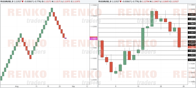
Comparison of Renko bars with Candlesticks
In the next chart above, this comparison is better illustrated.
On the left side we have a 20 pip renko bar and on the right side we have a regular candlestick chart.
The horizontal lines you see are split 20 pips.

Notice that in the first note mentioned ‘Renko bar closes at 1.11771‘ in the corresponding candlestick you can see that price in fact made a high and a low. But notice that the failure to close 20 pips above 1.11771 results in the Renko brick showing the close at 1.11771.
Now the next candlestick which has a strong open/close, you can see how price moved 80 pips in the day. Although the candlestick shows just one candle (representing the day) you can see that on the Renko chart, you have 4 Renko bars formed.
The same chart is now shown again without the wicks which represent the high and low.
This should be a lot easier to understand now. Below, you can see yet another illustration of how renko bars form, comparing them to Candlestick charts (and removing the wicks).
Want to understand how Renko bars work?
To thoroughly understand how renko bars form, you can read the additional resources below:
- How to read Renko charts?
- Renko chart types: Mean/Median Renko charts vs. regular Renko
- Trading the right box size with Renko charts
Are there any benefits of trading with Renko bars?
A commonly asked question by many traders is if there are any benefits of trading with renko charts.
Bear in mind that the common factor between a regular chart (candlestick/bar/line chart type) and Renko chart is price. But this is where the commonality ends.
While time is also a factor on the regular chart type, it is absent on a Renko bar chart.
It is true that a renko bar can show price trends very clearly.
But you can view trends on other chart types too….
So why do some traders such as myself prefer Renko bars?
This is because Renko bars make price action or indicator based trading a lot simpler. We know that support and resistance forms the basis for any trading style or strategy.
And Renko bars do a splendid job clearly showing the support and resistance levels, as well as the underlying price action minus the noise. Do Renko charts give you an edge in the markets? Not really.
But mastering Renko bars can certainly help in improving your trading confidence. Give this a try! You can test the free renko chart here.