
If you want to convert OHLC values to renko charts using python, this article provides a step-by-step guide to save OHLC values into Renko open and close values. On top of it, you can also manually plot the Renko charts using this same data.
Unlike the previous articles mentioned here, how to plot renko charts in python and plot forex EOD and intraday renko charts in python, this article takes a detour.
The main difference with the above two methods of plotting renko charts and this one is as follows.
In the first article, we make use of the in-built functions by calling the package mplfinance. As you can read in the article, the function mplfinance.plot() allows you to define the type of chart. Thus, when you select type = ‘renko’ the plot function automatically creates the renko chart for you.
In the second article, we simply improve upon the first by calling additional packages such as investpy to get and read data automatically. In the first article, we use the pandas_datareader to read the market data from yahoo finance.
The above two python scripts for renko work well. They are also easier for beginners to understand and use it.
But now comes the question of what if you want to convert the OHLC data to actual renko open and close prices?
This is where the above two codes fail since they directly call the plot function with the type renko through the mplfinance module.
In this article you will learn how to convert OHLC values to renko open close data. Furthermore, you will also learn how to then use the renko open and close data to plot renko charts using the good old matplotlib package.
Use cases – Convert OHLC values to renko open close values
Let’s briefly touch upon the use cases to convert OHLC values of any stock or instrument to renko open and close values.
If you want to create your own custom indicators, then using this method will give you greater control. The end result is that after you convert OHLC values, you can get the renko open and close data. This can be helpful if you have a custom indicator.
Furthermore, by converting the data from OHLC to renko open close, you can also save this data into excel for further analysis.
If you have some proprietary indicators, then you can apply them to the open or close values from this new data that you just saved.
The use cases for converting OHLC values to renko are many. Thus, if you are already reading this article, then you may have your own reasons for doing so.
Personally, I prefer this method to be a lot better since it gives you a lot more control on the data itself. So without much further ado, let’s deep dive into how you can convert OHLC values to renko charts.
Packages used to convert OHLC values to renko charts
Let’s talk briefly about the packages we will use in this method.
I will skip the usual packages such as pandas, dateutil, datetime and jump straight to the package where the heavy lifting happens.
The stocktrends package is a fairly reliable and a robust package for renko data in python. I have also been spending time on this package on github and try my best to troubleshoot issues other may face.
The stocktrends package can be installed via pypi.org
pip install stocktrends allows you to download the package which is then ready for import.
The package is very simple. In fact, if you head over to the indicators.py section you can see the different classes outlined. Among these, the class Renko(Instrument) is of importance to us.
Therefore, you can simply use from stocktrends import Renko to directly access this function rather than importing everything.
Once the packages are import, you can then start by fetching the data.
Fetching data from Yahoo Finance!
For this, we simply call the pandas_datareader.data and fetch the data.
Here, there are some assignments already made. For example year = 5 would mean to fetch 5-year historical data from today.
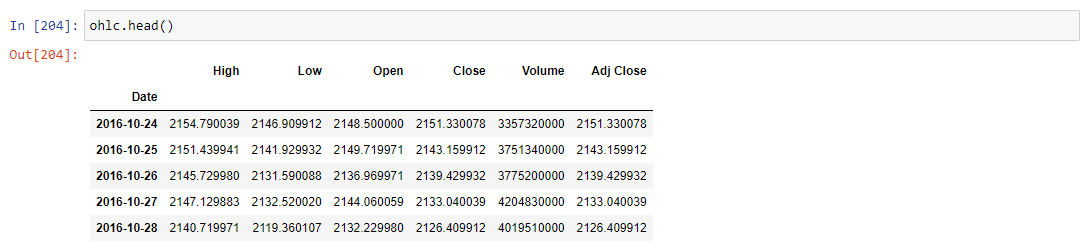
This market data is saved to the ohlc dataframe.
Once we have the data, this is where this method to draw renko charts using python differs.
Create a function to convert ohlc dataframe to renko
After the ohlc dataframe saves the data we need, the next step is to create a function. This makes things a lot easier. We create a function called df_to_renko(data, n).
Here, the data will be the dataframe that you just prepared (ohlc) and n = the fixed box size. Therefore, we can now call the function as
df_to_renko(ohlc, 50)For those curious as to what the function does, it simply takes the ohlc data we prepared and cleans it up.
In the first step, we reset the index (since the date field is used as index). Following this, we then convert all the column names to lower case.
Then, we also print out in case any of the values are null. This is a useful tool to avoid errors in the future.
Finally, we create a local dataframe df, and call the function Renko().
This function is part of the stocktrends package that we had imported earlier.
To learn more about what the Renko() function does, you can click on this link to go the respective file on github. You can go through the class Renko(Instrument) starting from line 25 through line 115.
Finally, coming back to our function, we save this data which now contains renko open/high/low/close and return this.
Converting ohlc data to renko and saving to excel
We can now call the function and assign it into a new dataframe already as seen below.
r_bars = df_to_renko(ohlc, 50)For convenience sake, we also have a print out of the total number of records in this dataframe which now comprises of the Renko open/high/low/close values.
To save this to excel, we call the pandas to_excel and pass in the dataframe which then saves it as output.xlsx (the file is saved in the same folder as where you script resides)
Plotting Renko charts using the renko open, close data
The next step is now to plot the Renko charts. Here, we use matplotlib’s rectangles to plot these bricks. We use this since we have avoided the easier solution as described in the previous articles.
In order to plot the renko charts, we further clean it up to retain just the open and close values. Since time is no longer a variable with renko charts, this makes our dataframe a lot smaller with just two columns.
new_df = r_bars[['open','close']]In the final section, there is quite a bit of code. The credit for this part goes to the code I found here which I have modified quite a bit.
# create the figurefig = plt.figure(1)fig.clf()axes = fig.gca()# Add 10 extra spaces to the rightnum_bars = 100df = new_df.tail(num_bars)renkos = zip(df['open'],df['close'])# plot the bars, green for 'up', red for 'down'index = 1for open_price, close_price in renkos:if (open_price < close_price):renko = matplotlib.patches.Rectangle((index,open_price), 1, close_price-open_price, edgecolor='black', facecolor='green', alpha=0.5)axes.add_patch(renko)else:renko = matplotlib.patches.Rectangle((index,open_price), 1, close_price-open_price, edgecolor='black', facecolor='red', alpha=0.5)axes.add_patch(renko)index = index + 1#adjust the axesplt.xlim([0, num_bars+5])plt.ylim([min(min(df['open']),min(df['close'])), max(max(df['open']),max(df['close']))])plt.grid(True)plt.show()
To break it down, we are doing the following:
- Since plotting the full 5-year history can make the renko bricks really small, we limit the number. This is done through
num_bars = 100 - This limits the # of renko bricks to 100. We then pass this into the dataframe’s tail and fetch the last or most recent 100 renko bricks.
- To change the # of bars, you can of course change the value of num_bars from 100 to 50 or even 200 if you wish.
- Using the zip() function in Python, we pass the two variables, which are basically the open and close columns from the renko dataframe. The zip function returns an iterator, with tuples containing the open and close we passed from the renko ready dataframe
- We then set our counter, index = 1 And being iterating through the tuples created through the zip function
- When the open is greater than close, we need a green renko bar. Likewise, we need a renko bar when the open is less than close
- Furthermore, we use the matplotlib.patches.Rectangle function, passing in the index and the open price as (xy) values
- Finally we than set limits on the x-axis, which starts at 0 and takes 5 extra spaces (via the num_bars+5) just to give some space to the right
- For the y-axis, we limit them based on the min. value and max value of the open and close.
The final output is as below.
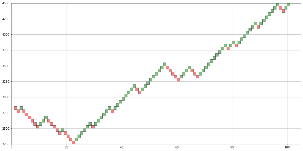
From OHLC to Renko open close chart
As you can see from the above, we have managed to get data from yahoo, convert the regular OHLC to renko based open, high, low close. We were able to save this data to excel. Following this, we also plot the renko chart using the Matplotlib module.
To access the full code, please visit the github page here.
This method is not as simple as the previous python scripts outlined. But at the same time, the code is not that difficult (although I wouldn’t have been able to do it if not for finding the original code here.) Overall, this method to fetch data makes it more in control. Most importantly, for those who want to use excel can also get this data which is saved.
In using this method to convert OHLC data to renko open, high, low, close, I hope to further bring in some additional information. It should not be too difficult to add simple indicators such as moving averages or Bollinger bands. But we will look at that in another article.