While trading, you will need to display the market prices in a visual way, and this is done through the trading charts. Several chart types have been created for this purpose, and they vary in many ways, but their function is the same.
The line chart is by far the easiest, and it is created by connecting the market prices of an asset over a given period of time with a line. The line drawn connects the closing prices reached within that trading period.
A bar chart is represented by a solid, vertical line, known as the bar, with small horizontal marks on the left and right sides. The one on the left represents the opening price while that on the right, the closing price.
The actual bar may extend farther above and below these horizontal marks to show the highest and lowest market prices during that trading period.
The candlestick pattern is just an improvement on the bar chart, filling the solid vertical line with a shade while still leaving some extensions beyond the filled body.
What are price only charts?
Among the typical trading charts described above, they all share one property – patterns are drawn according to a particular time interval. You can still alter the time frame, but each point marked on the chart will be determined by time.
Now, this might seem like an accurate way of illustrating price movements over a given period, but it is not the most effective when trading.
So, what happens when you strip away the effect of time and volume, leaving only the actual market prices to determine the chart pattern?
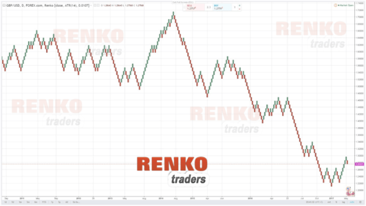
You get something like this:

This is a Renko chart representing the GBP/USD pair. The tern ‘Renko’ is derived from the Japanese equivalent of ‘bricks’, and you can see how the bricks are illustrated in the Renko chart above.
You probably already know how the ‘normal’ chart types are formed, but the Renko charts are very different. Instead of the bricks forming after every time interval, they form only after reaching a predetermined price movement. The trader can set the price movement required for the brick to form.
Say, you decide you would like a new brick to form after the price of the GBP/USD pair moves 50 pips, and the current price is 1.2750.
Let’s also assume that this price is marked by a green brick which covered prices ranging from 1.2700 to 1.2750. A subsequent green brick would only form when prices finally reached 1.2800 and a red one if prices reached 1.2700. it wouldn’t matter how long it took for the prices to reach the predetermined level, because the Renko chart only honors prices.
This is the nature of price only charts like the Renko charts, only the change in price leads to the formation of a pattern regardless of the change in time.
What are the benefits of using a candlestick chart?
The most popular chart type is definitely the candlestick chart. For the Forex, stock, futures and commodities traders, the candlestick chart has proven to be effective in illustrating market price movements. Even not all the best fx trading brokers provide their clients with such services.
There are several reasons for the chart’s popularity:
- It shows all the relevant market price points within a trading period. On a candlestick chart, a trader is able to know the opening/closing prices as well as the high/low points in the markets during that trading period and hence know the prevailing market sentiment
- They are visually appealing. A trader can choose to fill the body of the candlesticks with various colours to make the charts easier to look at and establish market direction
What are the benefits of using a renko chart?
Renko charts may not be as popular as the candlestick charts, but they have their own unique benefits.
- They are ‘cleaner’ than the rest. In this case, clean does not refer to the visual appeal of the charts, but to the reduction of noise. Candlestick charts are especially prone to noise because they have a body and shadows/wicks. These components make it harder to establish patterns in the markets because they create noise that has to be accounted for. On the other hand, Renko charts are made of similar sized bricks touching one another, and it is much easier to see a trend or pattern form
- Price movements are more accurately defined in a Renko chart. For planning purposes, it makes risk management easier since the price targets are very specific
- Renko charts are also visually appealing. Partly due to their simplicity and the addition of colour, Renko charts are not too difficult to interpret
Difference between price and time chart and just price chart
- All bricks in a Renko chart are similar in size while the candles in a candlestick may have varying sizes. Additionally, the candles can have accompanying shadows/wicks which further modify the size of the candles
- A new candle is formed every time the trading period ends in a candlestick chart, but a new brick will only form when prices reach the determined value in a Renko chart
- A technical analyst can determine market sentiment just by looking at the candlesticks, but Renko charts do not show the emotions at play in the markets
- Renko charts show very definitive support/resistance levels simplifying the process of identifying these areas
- Candlestick charts are the same for all traders looking at the same trading period whereas Renko charts allow the trader to set their own price region and get a personalized chart. This flexibility by the Renko charts allows it to fit into a trader’s strategy instead of the other way round
What chart type should you use?
There is no one chart that is better than the other in all aspects, and it will come down to how you trade and the familiarity you have with either chart. What is more important is to know how the various charts differ as well as their strengths and weaknesses, then taking their strengths to your advantage.

