Point and Figure charts are very similar to Renko charts as they plot only price. Time is not a variable with Point and Figure charts. The Point and Figure charts, or PnF for short are time independent charts and are visually unique.
PnF charts are identified by their unique X’s and O’s that are used. In terms of the way the point and Figure chart works, is somewhat similar to how a Renko chart works. Despite the similarities, there are a lot of differences between Point and Figure charts and Renko charts.
But first, here’s a brief introduction to Point and Figure charts.
What is a Point and Figure chart?
A Point and Figure chart is a unique charting technique using rising X’s and falling O’s in separate columns to plot price. These X and O visual represent rising and falling prices.
Similar to Renko charts, time is not a factor in Point and Figure charts. It is interesting to note that PnF chart is about a 100 year old charting technique which is very unique. Other chart types similar to Point and Figure charts include, Renko charts, Kagi charts and Range bar charts. But visually the other chart types are quite different.
Brief history about Point and Figure Charts
The Point and Figure chart are said to be over a 100 years old. There are no clear details on the origin of the Point and Figure charts. But a certain author, Hoyle was the first to mention this chart type in his book, The Game in Wall Street, published in 1898.
Later in 1933, Victor Devilliers published a book dedicated to Point and Figure charts.
Running with this, a company called Chartcraft Inc. took the concept and materialized into a charting platform. Chartcraft Inc. later pioneered the development of Point and Figure charts. They have also published many other books. Chartcraft Inc. later became InvestorIntelligence.com and continues to publish the Point and Figure charts online to this day.
Mike Burke from Chartcraft Inc. is one of the pioneers in Point and Figure charting. He went on to train many people including Thomas Dorsey. Dorsey, being one of his students is now one of the leading authorities on Point and Figure charting. Jeremy du Plessis gave a more detailed history into Point and Figure charts in his book The definitive guide to point and figure.
The term Point and Figure comes from the fact that traders used two different charts. One one chart they kept track of prices by writing the price values in the columns. When they noticed patterns in these price columns, they started using X’s and O’s. This eventually became the Point and Figure Charts as we know them today.
To this day, you can find some Point and Figure charts which also have numbers besides the X and O.
How do Point and Figure charts work?
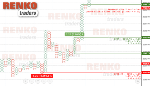
The X in the Point and Figure chart represents rising prices and O represents falling prices. Both the X and O represents a specific value. Thus, if the price increases by a specified number of points, a new X is plotted in the same column. Similarly when the price falls by a certain number of points, a new O is plotted in a column. When there is a reversal in price, the X switches to O in a new column. Likewise, the O switches to X in a new column representing a bullish reversal.
Point and Figure chart have two settings.
Box size and a Reversal box. The Box size value determines when a new continuation X or an O forms. The Reversal box determines how many opposite boxes need to occur for X to shift to O or vice-versa.
Understanding continuations and reversals in PnF chart
Consider this example of a Gold Point and Figure chart with a $1 size. If price increases by $5 from 1200, the PnF chart will show five X’s in a column, one above the other. In price terms, this is a move from 1200 to 1205. In a bearish scenario, if price moves from 1200 to 1195, then you also see five O’s in a column, one below the other.
So far, the above two represent the bullish and bearish price movements. But what about reversals?
A PnF chart has a reversal setting too. If we have a reversal box of 2, it infers that price must fall by $2 so that a new column opens for O’s to fill up. Similarly in a bullish reversal, price must move (close) by $2.00 so that a new column of X’s start to plot.
So, if gold is in a bullish trend rallying from 1200 – 1210 we get 10 X’s. And then let’s say that price fell to 1204. This would result in a new column with O starting at 1208. This will continue to plot four O’s all the way down to 1204.
In other words, a Point and Figure chart setting of 1×3, then price will plot a new X or O in the same column. But only as long as price rises or declines by 1 point. When there is a reversal in the trend by 3 boxes or more, a new column is initiated.
Accessing PnF Charts
Depending on the charting platform being used, you might see some markings on the chart such as 1, 2, 3 or A, B, C. This is more prominent on Stockcharts.com. The markings indicate the start of a new month to help traders as Point and Figure charts do not account for time. You can also access Point and Figure charts on Tradingview.com
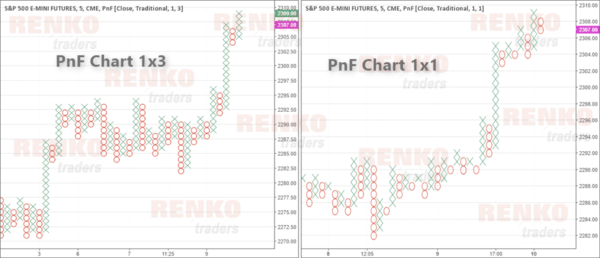
The default configuration for Point and Figure charts is usually 3 times the box size for reversal. But traders can also set it to 1×1. The next Point and Figure Chart below shows a comparison of a 1×3 and a 1×1 chart side by side.
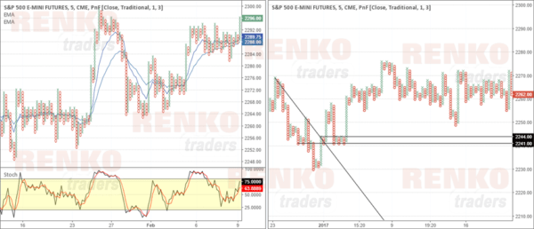
The Point and Figure charts are also more suited towards trading with price action than with using indicators. The next chart below shows an illustration of a moving average with Stochastics oscillator on the left and some trend lines and horizontal support levels on the right.
What are the differences between renko vs point and figure chart?
- Starting with the most obvious, Renko chart plots price as blocks or bricks. A bullish trend in price is represented by rising white or green Renko blocks or bricks and bearish trend in price is represented by falling black or red Renko bricks. On the other hand, Point and Figure Charts plot price as X and O, where X represents rising prices and O represents falling prices
- Point and Figure Charts have two settings, namely the box size and reversal amount, whereas Renko charts have just one setting which is a box size
- A new reversal Renko chart is formed when price falls or rises two times the Renko box size in the opposite direction. While a new Point and Figure X or O is formed when price rises or falls by the amount specified in the reversal box size setting. Therefore a Renko chart can be represented in PnF terms as a 1×2 configuration, where box size is 1 and a reversal size is two times the box size. On the other hand, a Point and Figure chart can have a 1×1 or a 1×2 or a 1×3 or any other setting of your choice
- Point and Figure charts are more suited for technical chart patterns such as double/triple tops and bottoms, flags/pennants, triangle and wedge patterns. Renko charts are suited for both chart patterns as well as technical indicators
What are the similarities between renko vs point and figure chart?
- Both Point and Figure Chart and Renko Chart are independent of time, meaning that both these charts focus only on price
- A Point and Figure Chart plots price in a new column when there is a change of trend. For example a switch from a bullish price to bearish price will result in a rising X column moving into a new falling O column. Similarly, a change from bearish to bullish price will result in falling O column shifting to a new column which will plot rising X’s.
- The base chart for Point and Figure chart is ideally tick chart, but M1, M5 or any time frame can be used as a base chart, similar to how Renko charts are plotted


