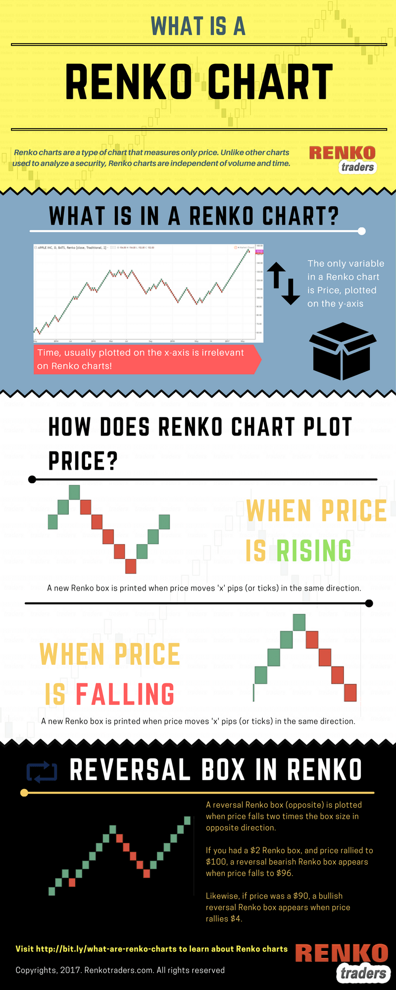
Renko charts are price charts that are independent of time.
The Renko or brick style of charts originated in Japan. This unique chart style’s name Renko, comes from the Japanese word Renga, meaning “brick.” The Renko chart is also known as neri, training or a zig zag chart.
Renko charts are widely used in different markets, including stocks, forex and futures. Therefore, traders use this unique chart style in just about any market they want to.
Updated: A simple infographic explaining how a Renko chart works
Renko charts are one of the most unique chart types and belong to a set of chart types such as Point and Figure, Kagi and Range Bars. The unique feature among such chart types is that they all focus purely on price.
It is because of this distinctive feature, that traders look to Renko charts to show price trends. Over time, Renko charts also became synonymous with terms such as noiseless trading, pure price action trading and many more. To understand what a renko chart is, let’s start with a comparison.
Comparing renko to candlesticks
The first picture below is a comparison between a Renko and a regular Candlestick chart.
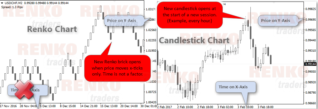
Pay attention to the notes on the image.
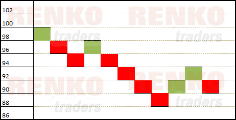
The next illustration below shows how a standard Renko chart looks like.
In order to build the Renko bricks, the box size or brick size must be determined. Traders typically use a fixed box size such as 5, 10 units or any value of their choice. Alternately, traders can also choose the 14 period ATR value to automatically select a Renko box size. There are obviously some factors to remember when using ATR for Renko box size.
After you determine the value to be set, the Renko bricks can be drawn.
Understanding price movements in Renko
When price moves “x” number pips or ticks that you specify, a new Renko bar pops up. As long as price continues in the same direction, every time price makes the same “x” pips movement, a new brick forms.
Things start to get interesting when price moves in the opposite direction. This is when the renko reversal brick forms. But the logic is somewhat different.
A reversal Renko bar forms when price moves twice the box size you set.
Also the red or the reversal Renko box plots in the next column and below the previous Renko box.
Among the different chart types, Renko charts are similar to Point and Figure charts. The similarity is in terms of the way the charts work. Visually though, a Renko chart is similar to a three line break chart. But it is not the same, as you will discover in the next section.
Comparing Renko to a 3-line break chart
The next picture below shows a comparison of the Renko chart with a 3-line break chart. To get a perspective, you also have a point and figure chart. This is done so as to get an idea on the three chart types that behave independently of time.
They are similar in some ways, but still unique from each other in their styles. It is because of this difference, you cannot just use a same trading strategy on all three types of charts show below.

History of Renko charts – Where did renko charts come from?
Traders refer to Renko charts as bricks. These bricks form on top of, or below the precious brick. They also shift to the right. The end result is that Renko charts visually stand out among other chart types.
Although Renko bars existed from a long time, it was brought to the West only a few decades ago. We already know about the origins of Renko charts. But well, someone had to learn this charting technique and then write about.. right?
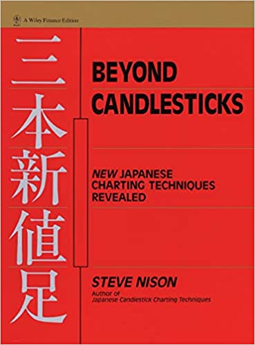
Credit goes to Steve Nison when he published his book “Beyond Candlesticks: New Japanese Charting Techniques Revealed”
According to data from Amazon, this book was first published in 1994. Therefore, you can see that Renko charts are still young comparing to its other siblings like candlestick charts.
It is no wonder, that Renko charts are still not that widely used comparing to other charting types.
But having said that, more and more traders are now starting to realize that Renko charts can indeed offer something different in terms of the market information.
At the same time, traders also start to get a false notion that trading with Renko charts can make you rich. Well, the truth be told, Renko charts are no magic charts. The risks of trading with a candlestick chart is the same as trading with Renko charts.
The biggest difference is perhaps in the way the prices are shown when trading with renko charts. But that’s about it.
How to construct a Renko chart?
The Renko Chart uses closing prices. But, traders can select any price that they want to. In fact most charting platforms such as Tradingview’s Renko charts allow you to choose between OHLC and median prices among other options.
Before we go into the details of how to construct a renko chart, I should mention that many charting platforms now do this automatically.
Gone are the days when you had to use an excel or hand draw renko charts. These days, at the click of a button you can easily configure renko charts. Read this tutorial on how to configure renko charts on Tradingview.
Constructing Renko – Brick by brick
However, the widely accepted notion is that a Renko chart uses closing prices, unless specifically mentioned.
To construct a Renko chart, the first step is to choose a price unit which becomes your Renko box size, or the renko brick size. When in doubt, you can always use a 14-period ATR to get an automatic value.
You can then experiment and fine tune the Renko chart’s box size to your liking. If you would like to learn more, then this article will teach you how to choose the right Renko box size to trade.
After you have selected price unit, it becomes the Renko height or the box size.
Therefore, if you selected a value of 2, then the two-point Renko chart will have all the Renko boxes that are equal in height with each Renko box 2 points tall.
Now that we are armed with the basics, the next step is to look at a table.
| Session | Closing Price | Renko Closing Price | Session | Closing Price | Renko Closing Price |
| 1 | 100 | 100 | 11 | 97<* | 98 |
| 2 | 101>* | 100 | 12 | 93<<↓{1} | 94 |
| 3 | 99<* | 100 | 13 | 90<↓(2) | 90 |
| 4 | 98<* | 100 | 14 | 87<↓(1)* | 88 |
| 5 | 98<* | 100 | 15 | 88> | 88 |
| 6 | 95<↓{1} | 96 | 16 | 92>↑{1} | 92 |
| 7 | 94<↓(1) | 94 | 17 | 95>↑(1)* | 94 |
| 8 | 96>* | 94 | 18 | 93<* | 94 |
| 9 | 97>* | 94 | 19 | 92<* | 94 |
| 10 | 99>↑{1} | 98 | 20 | 90<↓(2) | 90 |
> and < indicate when price increased or decreased
The number within () shows how many Renko blocks were formed and the ↑and↓ shows if it was a bullish or a bearish Renko box.
The number within {} indicates a bullish or a bearish Renko reversal brick with the ↑and↓ showing a bullish or a bearish reversal
* indicates that price did not the full 2 points so Renko box did not print that value. Newer Renko charts with wicks would show these levels as the ‘tails’
The chart below shows a brick-by-brick construction of the Renko chart based on the above table.
Trading with Renko bars
Traditionally, trading with Renko charts was largely confined to using the Renko chart as a trend following tool. This meant, buying on a bullish brick in continuation of the trend, or to wait for a bullish or a bearish Renko reversal box and buying accordingly.
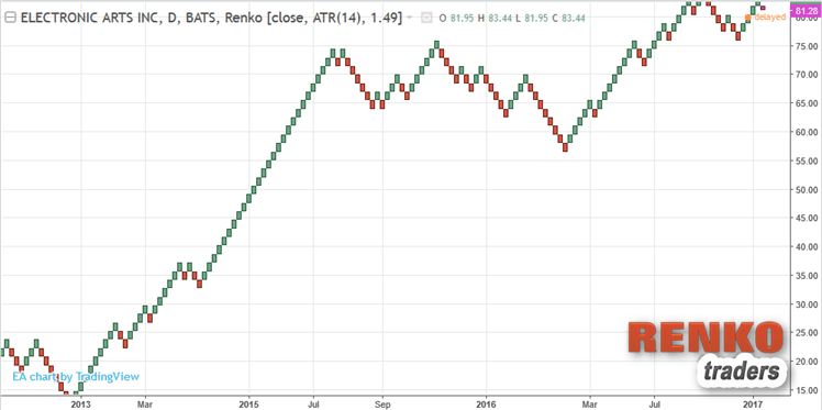
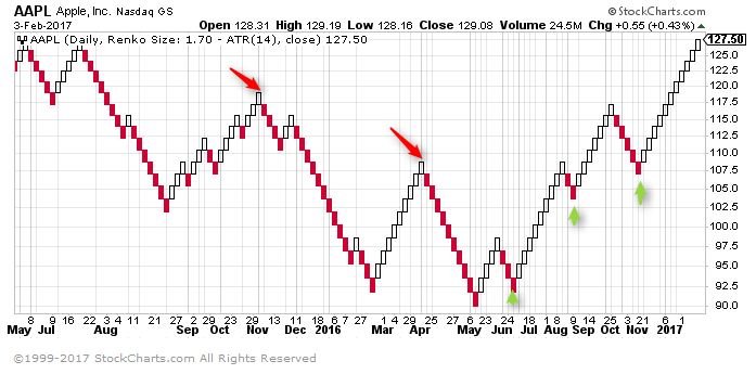
The chart below shows the $1.7 Renko box size for Apple Inc. stock. The chart shows how the Renko blocks can still be used as a trend following method to sell and buy into the downtrend and the uptrend.
However, since the days Steve Nison first dedicated a chapter to Renko charts, technology has made it possible to combine different technical indicators on the Renko charts.
We can now combine a mix of various technical indicators and a combination of drawing tools to trade with Renko charts.
What are the disadvantages of trading with Renko?
Trading with Renko charts requires a lot of patience and contrary to popular opinion, price action methods work a lot better than using technical indicators. However that is not to say that you cannot trade Renko charts with technical indicators.
In fact you can see a long list of Renko trading strategies here, based on many different technical indicators.
Most traders tend to switch to Renko charts after they haven’t had much success with the more conventional form of trading. Renko charts definitely do not make you rich overnight and neither are Renko charts the holy grail of trading.
One of the common traps Renko traders can fall into is paying too much attention to the technical aspect of trading and ignoring the fundamentals. This can be disastrous especially if you are trading stocks and analyzing the stocks based on Renko charts. Therefore a balance needs to be found.
For all the drawbacks, Renko charts are probably one of the most interesting chart types that I have found and as someone who has been trading with Renko charts, I really have nothing to complain.
Updated: We have now prepared a simple infographic explaining what is a Renko chart.