
Renko charts in python, seems like something that isn’t that commonly used. I have been scouring the internet and the shady corners of github looking for a code that could plot renko charts in python.
After looking around quite a bit (almost two weeks), I came across a two promising python codes.
But sadly, one code managed to convert the regular OHLC data into Renko format (brick size, etc) but failed when it came to plotting the renko chart itself.
On the other hand, I came across another code which seemed to use the same method, but again, there was not much of documentation available.
After giving a break to this searching for renko charts in Python, I went about my business doing other coding in Python.
And interestingly, out of nowhere, a python charting package that I was using for something completely unrelated had the answer.
Running a few tests and comparing with the trusty Tradingview charts, I am pleased to be writing this article. Here, I will introduce you to how you too can draw renko charts in Python.
This is probably the simplest of all methods I could find. Since this is not a trading related article, the format will change a bit.
So here we go!
Tools you need to plot renko charts in python
It goes without saying that you need to have Python installed on your PC or Mac/Linux. There are tons of articles and videos on that. So, I won’t get into the details.
You can basically use any IDE (integrated development environment) such as PyCharm, Microsoft Visual studio, Spyder or Jupyter Notebook.
Among the different choices, I will be using Jupyter notebook as it is easy to present. My code also has some comments and resources that you may find easy to refer to.
I also recommend using Anaconda as it is easier to manage packages through this app. You can download the Anaconda individual edition here, free of cost.
Now, I understand that not everyone is a coder and may not have any background in coding. But trust me, Python is the most easiest high level programming language you can lay your hands on.
But if you still feel intimidated by the word coding, worry not! This Renko chart python code is well commented. You will only need to change a few variables for it to work.
So hopefully you have powered up your IDE’s and ready to follow through.
How to plot renko charts using Python
To follow along, I will be using the Anaconda package manager, Jupyter notebook and of course using a Windows PC.
There are a few steps involved. I can quickly summarize them as:
- Loading the packages and setting up your IDE
- Start coding
In the method, I describe below, we will be reading data from an external source, saving it into a dataframe (don’t worry if this doesn’t make sense to you) and finally we will plot the renko chart.
And there are two ways to plot renko charts. Fixed brick or ATR. Now when it comes to coding, you can basically pass in any value since this code will not plot renko chart in real time.
But if for whatever reason you also want a renko chart with ATR, then I cover that in the second section of this article.
Below, we will get started with plotting renko chart in Python using a fixed brick size.
Loading the required packages and powering up Jupyter notebook
The first step is to make use of a package called mplfinance.
This is a package that is used for plotting graphs of different kinds. You can basically plot a line chart, bar chart, candlestick chart and of course renko charts. And as a bonus, you can also plot a point and figure chart using mplfinance.
If you haven’t used this package before, I recommend you to first install this.
- From the start menu type for Anaconda Prompt
- You will see the command terminal in the results, so just click on it
- In the prompt, type in pip3 install mplfinance
- You can watch the command terminal as it downloads the package for you.
- I also recommend, installing pandas package too in the same way (pip3 install pandas)
- Optionally, choose to install pandas_datareader package as well (since we will be reading data externally)
After the packages are ready, you should fire up your Jupyter notebook.
Go to the Windows start menu and type Jupyter and click on the result which reads Jupyter Notebook (Anaconda)
When you load the Jupyter notebook, it will open a web browser and it will have an address like localhost:8888/notebooks/etc…
How to write Python code to plot renko charts
Click on the ‘New’ and select Python 3 which opens up your new file.
In the first line, paste the following:
import pandas as pd
from pandas_datareader import data as pdr
import mplfinance as fplt
The above three lines simply imports the pandas, pandas_datareader and the mplfinance packages.
- pandas package will be used for converting the data into our desired format
- pandas_datareader will be used for reading/fetching data
- .plfinance is where the magic of renko happens.
Note that after importing, we assigned short names using as xxx this is to make it easier to reference them in the code later on.
The next step is to assign a few variables.
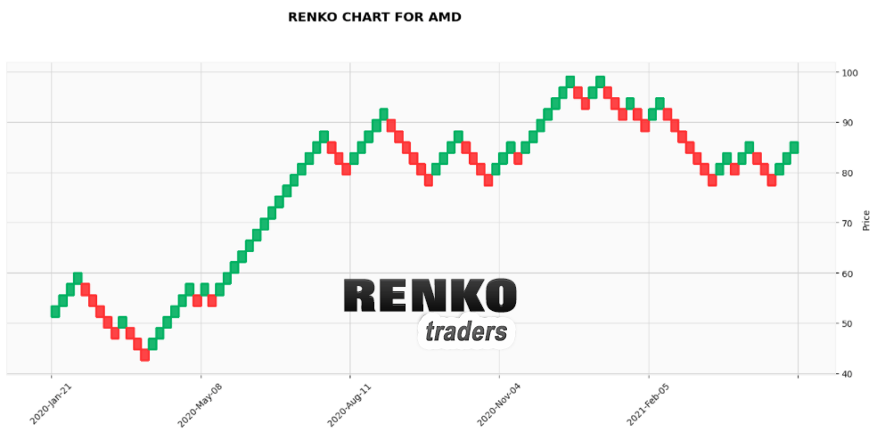
ticker = "AMD"
sdate = "2020-01-01"
size = 2.5
df = pdr.get_data_yahoo(ticker, start = sdate)
Here, ticker, sdate and df are the variables.
- The ticker, as you can see currently consists of AMD ticker
- sdate variable is the start date to get the stock data
- df is the variable of type datagrame which uses the panadas data reader function to get_data_yahoo.
- The get_data_yahoo simply takes the value of ticker and sdate to get the data
Now if you type df, you dataframe will look like below.
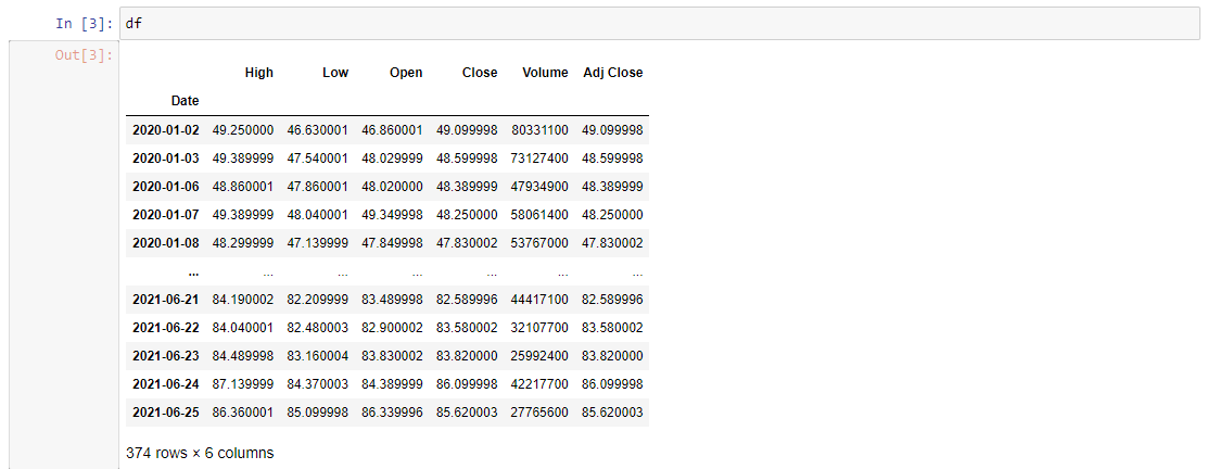
You can see that it has the High/Low/Open/Close/Volume/Adj Close with Date as the index.
At the bottom you can also see that we have 374 rows (or 374 records and the 6 columns we just got).
And finally, we just plot the chart using mplfinance.
fplt.plot(df,type='renko',renko_params=dict(brick_size=2.5),style='yahoo',figsize =(18,7))
This is the line of code is where all the magic happens as you get your Renko chart in python
Plotting Renko charts using mplfinance
We call the fplt.plot() function which takes many variables. Below is an explanation of each of these variables used in the fplt.plot() function
- df, which is the variable which stores our dataframe
- type = ‘renko’ is the chart type that is required to plot as renko (If you want to plot a point and figure chart just replace renko with pnf
- the renko_params is the parameters that you pass into the chart. It takes the argument (brick_size). This is the renko brick size used for plotting the renko chart
- style is mostly used for outputting the charts in different styles. You can replace yahoo with charles, classic, etc.
- Finally, figsize = (width, height) assigns the chart’s width and height.
Full code to fetch Yahoo data and plot renko charts
And here is the full code that we use:
#Import the required packages.
#Make sure that you have installed them before using it
import pandas as pd
from pandas_datareader import data as pdr
import mplfinance as fplt
#Assign variables ticker, sdate, size which is the brick size
ticker = "AMD"
sdate = "2020-01-01"
size = 2.5
#Use the get_data_yahoo() function to get the ticker and start date from variables
#get_data_yahoo() will get data from the assigned start date to recent date
#Save the data to dataframe
df = pdr.get_data_yahoo(ticker, start = sdate)
#Print the dataframe just for reference. You will see 6 columns and the no. of rows
#will change depending on the start date value
print(df)
#call the fplt.plot function and execute
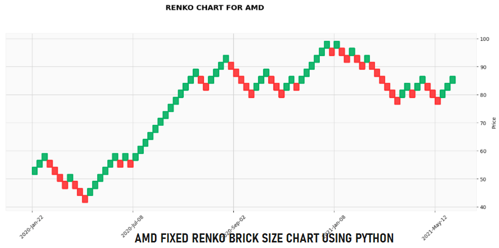
fplt.plot(df,type='renko',renko_params=dict(brick_size=size),style='yahoo',figsize =(18,7), title = "RENKO CHART FOR {0}".format(ticker))
And here is the output.
Plotting Renko chart using ATR in Python
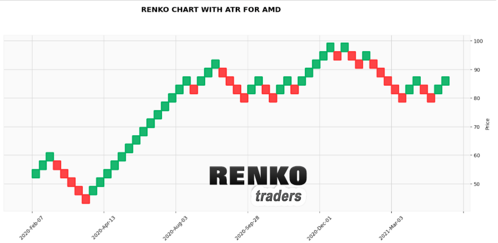
To plot or draw renko chart using ATR or average true range, then you just need to use this code: It is basically the same. The only difference is in the “brick_size=’atr’, atr_length=2”
fplt.plot(df,type='renko',renko_params=dict(brick_size='atr', atr_length=2),style='yahoo',figsize =(18,7), title = "RENKO CHART WITH ATR FOR {0}".format(ticker))
Below is the same chart, but using the ATR length of 2 periods.
As per the mplfinance documentation you can set the atr_length = 2 which means it takes the ATR for the past two days. To use the entire dataset’s ATR, just change
atr_length = 2 toatr_length = 'total'
And here is the output using the full dataset’s ATR value. Remember we had 374 rows, so the ATR will be of the full 374 days.
How do the Python renko charts compare?
Now that we managed to get renko charts in Python, the next question that comes to mind is whether they are reliable. To answer this, we can simply compare the python renko charts with same settings on Tradingview charts.
Note that since we are using EOD data from the dataset, I will use the same settings on the Tradingview renko charts as well.
Fixed Renko Chart Comparison – MSFT (brick size = 2, base chart = D)
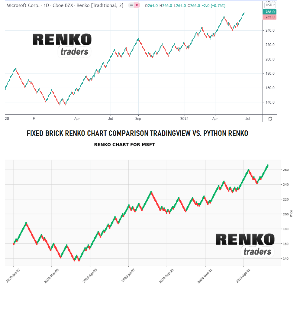
Please click on the above chart to enlarge. The renko boxes from Python code is almost the same as with Trading view.
14 Period ATR Renko Chart Comparison – GOOG (ATR = 10, base chart = D)
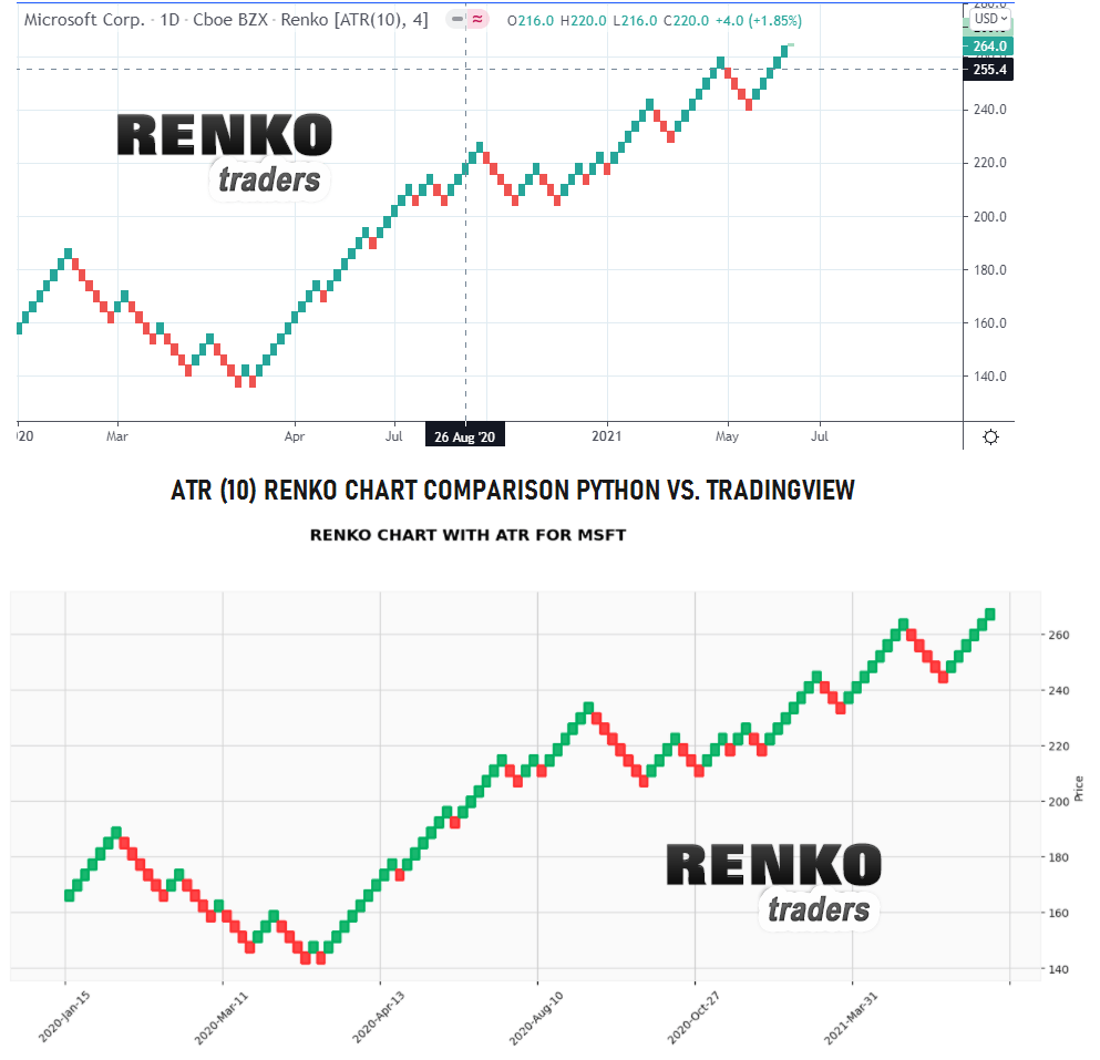
Click on the charts to see the enlarged version. To make comparison easier, I have removed the wicks from the Tradingview renko charts. This enables a better comparison between the two.
Overall, this is a great way to observe Renko charts (without using any real time data). While clearly the wicks or tails are missing, the renko charts provide just enough information. You cannot obviously trade on the python renko charts. You could however use this as a hobby or you can also use the python renko charts to observe the price movement.