
Using Python, it is now easy for anyone to plot forex EOD and/or intraday renko charts. This article outlines a step by step guide on an easy way to plot forex renko bars with Python.
The previous article gives the basic outline how we can plot any stock chart with renko bars. It is recommended that you read this article first. It will lay the foundation for python forex renko charts in this article.
We will make use of the same libraries, which is the mplfinance package. As you may already know, if you have read the previous article, mplfinance automatically renders renko charts in Python.
There are a few python codes floating around that will convert the timeseries into renko readable timeseries. However, I find it to be quite complex. Using mplfinance, it is a lot more easier to plot both EOD as well as intraday renko charts.
This article assumes that the reader already has Python installed. If you haven’t, visit https://www.python.org/downloads/ and download the installer for Windows, Linux or MacOS.
You will also need to use Jupyter notebook, as that is what we will be using in the rest of the article. Before we dive any further, you may wonder why use renko python charts for forex.
For the forex markets, the renko charts can be rendered directly on your Metatrader 4 platform. However, there are some instruments (which I have learned) such as the synthetic indices from Deriv.
Unlike other instruments, deriv tends to reset their data for synthetic indices. You can read more about this here.
Regardless, using renko charts in python offers an alternative to the existing possibilities.
Plot EOD forex renko charts with Python
To plot EOD or end of day forex renko charts using Python, we need to import two packages.
- Investpy: The investpy is a package from investing.com and allows you to import EOD data across different asset classes such as stocks and forex
- mplfinance: As you may be already familiar, mplfinance is a charting package that is built up on the famous matplotlib. mplfinance extends the capabilities and includes the option to render renko charts
Using the above two, we will import the data using investpy and then plot the renko chart using mplfinance.
The main benefit of using the combination of the above two packages is that you can simply refresh the code once a day. This will then automatically plot the renko chart on a daily basis.
Furthermore, we will also expand the above function to include two renko charts. The first renko chart will use a larger brick size and the second renko chart uses a smaller brick size.
A combination of the two renko brick size charts will allow traders to view the markets in a similar fashion as you would use multi-time frame analysis with traditional candlestick charts.
Let’s now go through the code in detail.
Import the packages
The first block of code will import the various packages we need to render the python renko charts.
We make use of the pandas for dataframe handling followed by investpy which is the package to fetch the timeseries data.
We then import the mplfinance package which will render the renko charts in python.
The remaining packages, which is datetime, pandas.tseries.offsets are used for handling the datetime functions.
The datetime functions are important because this will be used to automatically set the investpy to fetch EOD data as of the previous business day.
import pandas as pd
from pandas_datareader import data as pdr
import investpy
import mplfinance as fplt
from datetime import datetime
from pandas.tseries.offsets import BDay
from matplotlib.ticker import FormatStrFormatter
Finally, we use the matplotlib.ticker to enable four decimals on the y-axis. By default, the mplfinance will plot just two decimals.
Create the variables to use in renko python charts
In the following block we will define the variables. This is where you will be modifying the major settings to get forex renko charts in python.
#Input the main Renko and lower renko box sizes here
size1 = 0.0050
size2 = 0.0010

#Input the currency here
ccy = 'USD/CAD'

#Gets the last business day
l_bd = datetime.today() - BDay(1)
l_bd = l_bd.strftime("%d/%m/%Y")
bd = datetime.today() - BDay(1)
bd_filter = bd.strftime("%Y-%m-%d")
The comments in the code is self explanatory.
The size1 will be the fixed pip size for the main renko chart, while size2 will be the fixed pip size for the second renko chart. Needless to say, the first size must be higher than the second. This will help you to understand how the trend in the larger brick size renko is, comparing to the smaller brick size renko.
The ccy is the variable that holds the currency pair for which you want to get data. You should use the format of XXX/YYY. So, if you want to get the renko charts for EURUSD, then the ccy = ‘EUR/USD’
The next section of the comment deals with the datetime handling. It gets today’s date and then looks back to the previous business day.
Since investpy allows only for EOD data, this is important. The second part of the date time code converts the dates into the format that investpy requires. This is the format of DD/MM/YYYY
Finally, we also make use of another variable called bd_filter. This is the variable which uses a different format of YYYY-MM-DD. This is the filter that will be later passed on into the final renko charts.
You obviously don’t want to plot the entire historical timeseries, which will make the renko bars unrecognizable.
Get the data and save to dataframe
In this step, we will now pass on the variables using the investpy functions and get the data and save it into a dataframe.
# By default, the start date is set to 01/01/2010. You can change this if you want
df = investpy.get_currency_cross_historical_data(currency_cross=ccy,
from_date='01/01/2010', \
to_date=l_bd)
#Note that date is automatically set as index, so there is nothing more to do for you here
print("\nPrinting the first five rows of the dataframe")
df.head()
No changes are needed here. The from_date is set to 01/01/2010. If you want a bigger timeseries data, you can change to any other year of your choice.
The print function and the df.head() will render the dataframe’s first five records. Similarly, we do the same for the last five records.
print("\nPrinting the last five rows of the dataframe")
df.tail()
This is done so that we get an idea of where our timeseries starts from and at which date it ends.
Plot renko charts in python with EOD data
In the final step, we will plot the renko charts in python.
#Print the main renko chart using the larger brick size
#Change mav=() values to set the simple moving average values of your choice
fig,axlist = fplt.plot(df['2019-01-01':bd_filter],type='renko',renko_params=dict(brick_size=size1),\
mav = (10,50),style='yahoo',figsize =(18,7), \
title = "{0} PIP RENKO CHART FOR {1}".format(size1*10000, ccy),returnfig=True)
axlist[0].yaxis.set_major_formatter(FormatStrFormatter('%.4f'))
fplt.show()

#Print the second renko chart using the larger brick size
#Change mav=() values to set the simple moving average values of your choice
fig,axlist = fplt.plot(df['2021-04-01':bd_filter],type='renko',renko_params=dict(brick_size=size2),\
mav = (10,30),style='yahoo',figsize =(18,7), \
title = "{0} PIP RENKO CHART FOR {1}".format(size2*10000, ccy),returnfig=True)
axlist[0].yaxis.set_major_formatter(FormatStrFormatter('%.4f'))
fplt.show()
In the above code, we call the plot function twice since we will be using two different renko box sizes.
Note the mav option. This is the default simple moving average function that you can use with the mplfinance package. In the case of the larger brick size, we used a 10, 50 simple moving average to be rendered. In the second renko chart using the smaller box size, we use the 10 and 30 period SMA settings.
The final output of the forex renko chart in python using EOD data looks like below.
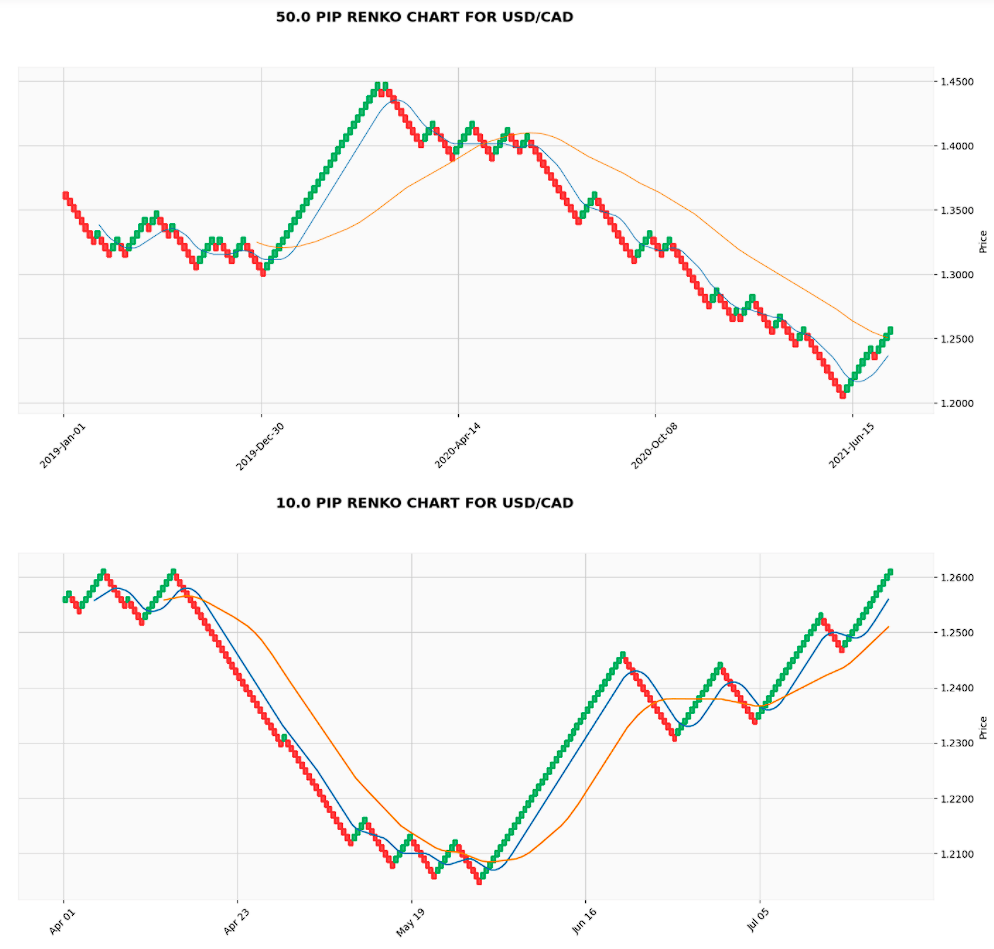
Click on the above chart to view a larger size of it.
You can access the full code from github here.
Plot intraday forex renko charts in python
To plot the intraday forex renko charts in python, we take a slightly different path. There are multiple ways you can do this. For example, a quick googling will show various forex API data providers from which you can request the intraday data.
But to keep things simple (and considering the fact that just about every forex trader has access to Metatrader4), we will use this option.
To plot the intraday forex renko charts, we merely download the CSV data from Metatrader history center. We then call this csv file and prepare our dataframe. Once the dataframe is ready, the rest of the process remains the same.
How to download intraday forex data from Metatrader 4
Go to tools > History center on your MT4 trading platform. Alternately press F2 to pull up the history center window as shown below.
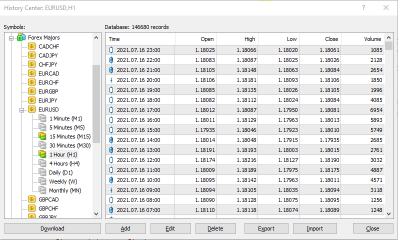
Make sure that you have downloaded the data completely. Then go to the timeframe of your choice. In our example, I use the one-hour timeseries data.
import pandas as pd
import mplfinance as fplt
Read the CSV data and format it
The next step is to read in the csv file and format it. This is because the default csv file uses formats that are not very useful and also there are no header columns for the csv file either. So this step deals with cleaning up the csv file and saving it to a dataframe in a format that is easier to handle.
The below code gets the csv file and also gives it a column header in the following format.
df = pd.read_csv('EURUSD60.csv', names=["date", "time", "open", "high", "low", "close", "volume"],parse_dates=True)
print("\nPrinting the first five rows of the dataframe")
df.head()
Now print the last five rows using the df.tail() function.
print("\nPrinting the last five rows of the dataframe")
df.tail()
If the data looks good so far, the next step is to re-format some of the columns.
df['date'] = df['date'].str.replace('.', '-', regex=True)
df['date_time'] = df['date'] + ' ' + df['time']
df.head()
In the above code, we are simply replacing the date column from yyyy.mm.dd to the yyyy-mm-dd format. In the second line, we add a new column called date_time and merge the fields from the date and time column.
Eventually we want to get the date_time column as yyyy-mm-dd hh:mm:ss
Then in the next step, we drop the columns we no longer need, which is the date, time and volume.
df.drop(columns = ['date','time','volume'], inplace=True)
df.head()
Once again we use the head() to get the first five rows to check if everything is in order.
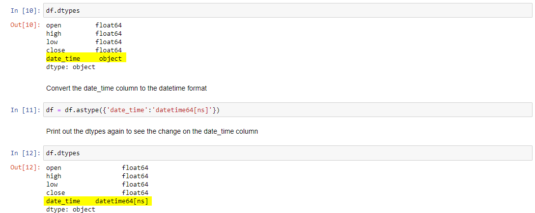
Despite the above process, our date_time column is still not in a format that can be easily handled. Hence, we need to change the format. To do this, we first print out the data types and then convert the date_time column into the datetime64[ns] format.
df.dtypes
df = df.astype({'date_time':'datetime64[ns]'})
df.dtypes
After the above code, we once again print out the dtypes, which now becomes the format we can use for plotting the renko chart.
Once we have the format ready, we will begin filtering the data.
Filtering the forex intraday data for renko charts in python
In this step, we will filter the data from the main dataframe and set it to a new dataframe called filt.
filt = df[(df['date_time'] > '2014-12-31 23:59')]
filt.set_index('date_time',inplace=True)
# Print the tail end of the filt dataframe
print(filt.head())
print(filt.tail())
In the above code, we are removing all timeseries that before 2015. In doing so, our data is a lot more manageable.
We then use the tail() and the head() to see the starting dates after the above filter is run.
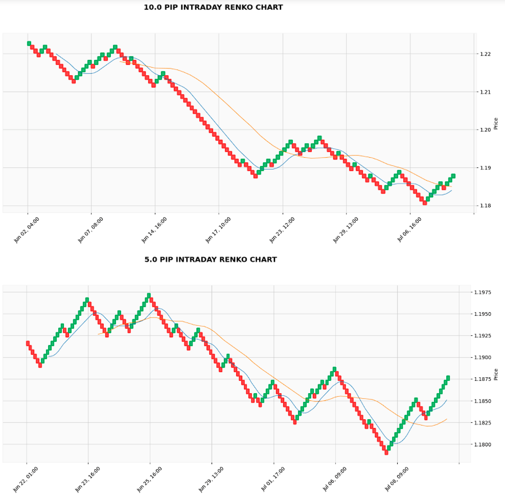
Plot forex intraday renko chart in Python
In the last step, we will now plot the renko intraday charts using python.
size1 = 0.001
size2 = 0.0005

fplt.plot(filt['2021-06-01 23:00:00':'2021-07-09 23:00:00'],type='renko',renko_params=dict(brick_size=size1),\
mav = (10,30),style='yahoo',figsize =(18,7), \
title = "{0} PIP INTRADAY RENKO CHART".format(size1*10000))

fplt.plot(filt['2021-06-21 23:00:00':'2021-07-09 23:00:00'],type='renko',renko_params=dict(brick_size=size2),\
mav = (10,30),style='yahoo',figsize =(18,7), \
title = "{0} PIP INTRADAY RENKO CHART".format(size2*10000))
The size1 and size2 follow the same format as earlier. size1 is the larger timeframe renko chart and size2 is the smaller time frame renko chart.
Note that when using the smaller timeframe renko chart, you should adjust the start date so that the intraday renko chart in python does not get too cluttered. The final output is as below.
You can also make changes to eh mav=(10,30) to configure the a simple moving average setting as well.
You can download the full code here including the 60-minute EURUSD intraday forex timeseries as well.
I hope the above brief tutorial is helpful for those who want to experiment the capabilities of rendering renko charts using Python.